Template
Quiet Editorial
A homepage for an independent journal that reads like a printed magazine: one muted photograph, a serif headline, an issue number and a short article list.
Print-style journal homepage · Website · Portfolio · single page: hero and one section
A mock-up of the homepage, drawn from this design’s layout, palette and typefaces. A build follows the full prompt below.
Add app screens
Pick up to 6 screens, such as a dashboard, settings or an empty state. Each is built in this design’s own palette and typefaces, with its states and guardrails.
Start from this templateRead the build prompt

Typefaces
Gilda Display is a soft high-contrast serif that reads like a printed masthead; Wix Madefor Text is a quiet, open sans for standfirsts and labels.
- Gilda DisplayHeadings: the serif headline and article titles
- Wix Madefor TextBody: standfirsts, the issue number and the read pill
Who it is for
- Readers and subscribers
- Writers pitching stories
- Advertisers
Layout
- Paper page with the photo blurred into a pale teal wash at the edges
- Tiny nav on top
- Photo on the left half, serif headline and issue number on the right
- Read pill under the standfirst
- One supporting section: an article list in two columns, title and one line each
Palette
Muted, literate, patient.
- paper
#e9eef2 - slate teal
#2f3f4c - ink
#080e1c
Every checked pair, measured again
| Sample | Where | Ratio | Needs |
|---|---|---|---|
| Aa | body text on the page | 16.49:1 | 4.5:1 |
| Aa | text on cards and chips | 19.27:1 | 4.5:1 |
| Aa | secondary text on muted surfaces | 6.61:1 | 4.5:1 |
| Aa | secondary text on the page | 8.11:1 | 4.5:1 |
| Aa | label on the primary action | 9.28:1 | 4.5:1 |
| Aa | label on secondary surfaces | 19.27:1 | 4.5:1 |
| Aa | label on the accent | 19.27:1 | 4.5:1 |
| Aa | error label | 4.55:1 | 4.5:1 |
| primary action against the page | 9.28:1 | 3:1 |
As vibld’s tokens
The palette on the 15+ color tokens vibld styles a project with, each text color on the fill it is read on. Marked tokens are solved from the palette, because no swatch held that role at 4.5:1.
- background
- card
- muted *
- primary
- secondary
- accent
- destructive *
Type scale
- Display
- Gilda Display, the serif headline and article titles
- Body
- Wix Madefor Text, standfirsts, the issue number and the read pill
Spacing and imagery
12-column grid with a 1280px measure; headline across columns 7 to 12; article list in two columns below.
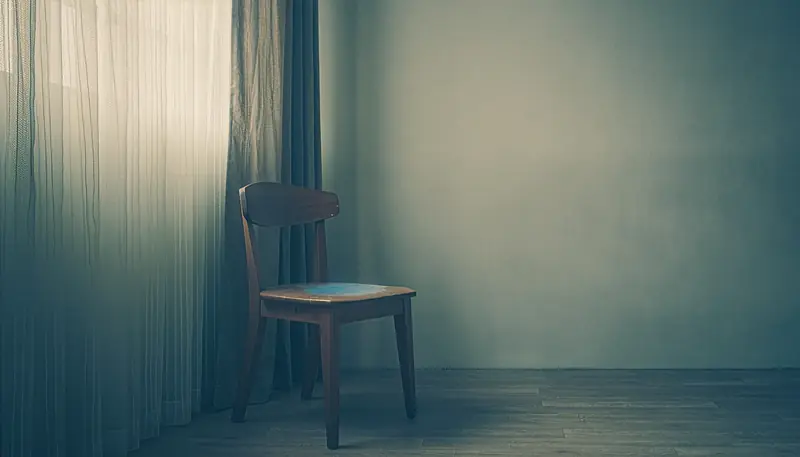
A muted teal and brown editorial photograph of a quiet interior or landscape, soft daylight, film grain. No text in the frame; space on the right for the headline.
Components
- Issue number
- Read pill
- Article list
- Blurred hero echo background
Interactions
- Text fades up line by line
- The photo zooms in very slowly while in view
Data
Content{headline, subcopy, cta, section items}
Build prompt
The baseline every prompt in the catalog assumes, then this design’s own ten sections, from goal to guardrails.
The baseline
### How to use these prompts
Each Cinematic Hero prompt describes one page: a full-bleed hero built around a single generated image, and one supporting section in the same style. The rules below apply to every one of them.

### Cinematic Hero principles
- One full-bleed hero per page. The image is the subject, not decoration.
- An oversized display headline of two to four words that runs past an edge or overlaps the subject. It is live text, never part of the image.
- A tiny nav: a wordmark and three or four small links, one pill-shaped primary action, and at most one quiet secondary action.
- The hero image returns as the page background, blurred 40 to 80px and darkened, so the hero sits in a card with 24 to 32px corners.
- A tight palette: two or three colors taken from the image and one accent, used mostly on the primary action.
- A distinct display face with a quiet body face. Small labels get wide tracking.
- Small glass or chip details (a stat, a tag, an avatar row, a counter), never a wall of features.
- One signature motion and a staggered text reveal. prefers-reduced-motion turns every loop off and shows still frames.
- On phones the headline keeps its bleed at a clamp() size, the subject stays in frame, a video becomes its poster, and chips stack under the action.

### Engineering baseline
- TypeScript strict mode, small typed components, and one source of truth for design tokens (CSS variables consumed by Tailwind).
- All copy lives in one typed content file, so the owner can edit words without touching layout.
- Every form validates on the client, says what went wrong in plain words beside the field, and never claims success it has not had.
- No secrets in the bundle and no third-party scripts beyond Google Fonts.
### Goal
Build **Quiet Editorial**: A homepage for an independent journal that reads like a printed magazine: one muted photograph, a serif headline, an issue number and a short article list. It is one cinematic hero and one supporting section, in the Cinematic Hero series.

### Stack
React + TypeScript + Vite and Tailwind CSS. Motion in CSS and the Web Animations API. No backend: the page is static, and any form keeps its result on the page until the owner connects an endpoint.

### Pages & layout
1. Paper page with the photo blurred into a pale teal wash at the edges.
2. Tiny nav on top.
3. Photo on the left half, serif headline and issue number on the right.
4. Read pill under the standfirst.
5. One supporting section: an article list in two columns, title and one line each.

Copy to start from, all in `content.ts`: headline "The Slow Issue", subcopy "Issue 14: on patience, repair and the long way round.", primary action "Read the issue". On phones the headline keeps its bleed at a clamp() size, the subject stays in frame, and chips stack under the action.

### Design system
Mood: Muted, literate, patient.

Palette: paper `#e9eef2`, slate teal `#2f3f4c`, ink `#080e1c`. Tokens: background `#e9eef2`, foreground `#080e1c`, primary `#2f3f4c` with `#e9eef2` labels, cards `#ffffff`.

Type: Gilda Display for the serif headline and article titles; Wix Madefor Text for standfirsts, the issue number and the read pill. Load both from https://fonts.googleapis.com/css2?family=Gilda+Display&family=Wix+Madefor+Text:wght@400;500&display=swap. Small labels in Wix Madefor Text with 0.12em tracking.

Corners: 28px on the hero card, 16px on cards, pills fully round. Spacing: 12-column grid with a 1280px measure; headline across columns 7 to 12; article list in two columns below.

Hero image: A muted teal and brown editorial photograph of a quiet interior or landscape, soft daylight, film grain. No text in the frame; space on the right for the headline. The series made this image for the design: https://vibld.com/img/cinematic/quiet-editorial.webp, 2688 by 1535, alt text "A wooden chair by a curtained window in a muted teal room". Use it by that absolute URL, with `srcset="https://vibld.com/img/cinematic/quiet-editorial-800.webp 800w, https://vibld.com/img/cinematic/quiet-editorial-1600.webp 1600w, https://vibld.com/img/cinematic/quiet-editorial.webp 2688w"`, unless the person has uploaded a hero image of their own, which then takes its place. Never a placeholder photo or a stock image of people.

### Components & interactions
- Issue number
- Read pill
- Article list
- Blurred hero echo background

Motion:
- Text fades up line by line
- The photo zooms in very slowly while in view

The signature motion is: A slow photo zoom. Keep it to that one; everything else is a 150 to 300ms state change. With prefers-reduced-motion, loops stop, videos show their poster and reveals are instant.

### Data & state
All copy and the supporting section's items live in one typed `content.ts`. Inputs validate as the visitor types and report a result inline; nothing is sent anywhere until the owner connects a form endpoint.

### Accessibility
WCAG 2.2 AA. The headline is real text, not part of the image, and the image has alt text describing it. Every control has a visible focus ring and a 44px target. Verified contrast: body text on the page #080e1c on #e9eef2 16.49:1; text on cards and chips #080e1c on #ffffff 19.26:1; secondary text on muted surfaces #404652 on #d3d8dd 6.60:1; secondary text on the page #404652 on #e9eef2 8.11:1; label on the primary action #e9eef2 on #2f3f4c 9.28:1; label on secondary surfaces #080e1c on #ffffff 19.26:1; label on the accent #080e1c on #ffffff 19.26:1; error label #ffffff on #d93a3a 4.54:1; primary action against the page #2f3f4c on #e9eef2 9.28:1.

### Security
No third-party scripts other than Google Fonts. Forms carry a hidden honeypot field and cap input length.

### Performance & SEO
Serve the hero image as AVIF or WebP with its width and height, `fetchpriority="high"` and no lazy loading; the blurred echo reuses the same file with a CSS filter. Preconnect to Google Fonts. Title and meta description come from `content.ts`. Largest contentful paint under 2.5s on a mid-range phone.

### Guardrails
- Avoid: Card-heavy blog layouts.
- One accent color, one primary action, at most four nav links.
- No carousel or slider in the hero, no mega menu, no emoji or clip-art icons, no hard offset shadows.
- No purple-to-blue gradient and no stock photos of people at desks.
- The brand is invented. Use no real company's name, logo or trademark.